The model is not standing but she is like a babiey girl and like a kid as well flying away in her owen way and she is looking at us that makes a drictmode of interest this makes a bond with who want to buy this is effective because it want us to buy it.
Their facial expression you cant see it that well but if you can it is a sexual face slightly and it make it look sexy and the backround is in the city of love so it fit in as well.
The location for the adverts it is in france the city of love and romance and they pick a good back ground to sell a perfume and the text is in franch this is effective to us because selling a sexy purfume next to big ben not that sexy like it says L'EAU, see this makes it look sexy but it means water don't sound sexy in english so it play's tricks on us in other language.
The Camera is at a long shot and not at an angel but it shows it has to be because it is a sexy perfume and they zoom out to show france and it is beautifull.The editing they have yoused to her is thay giver her a darker than to inprove her appearance but in the vido she was light skined so photo shop was used in the still image this show need to make a better effects.
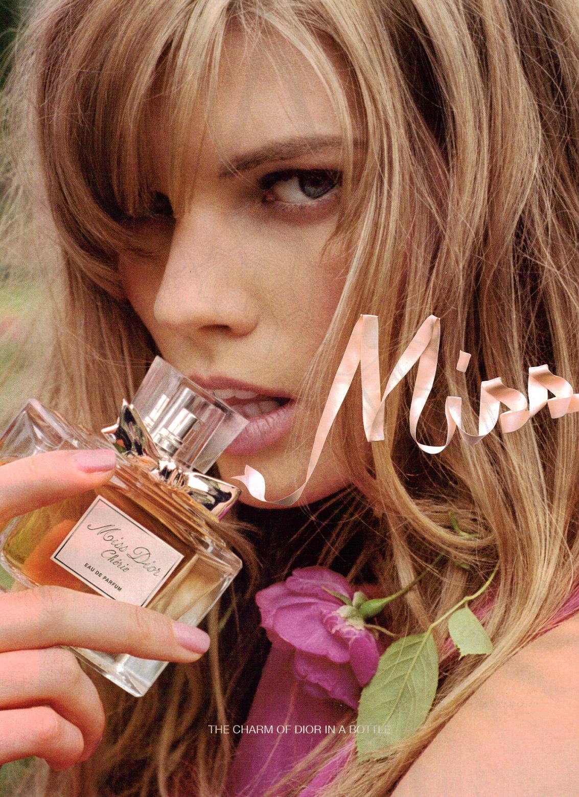
the text they used they pick three types for the Dior is a stranded/formal type and for the Miss Dior is free hand and it is in the air? not really they are using a green screen for this as for this you can tell because the back round is all pistillate and the Miss Dior is made of silk he name of thr perfume is Cherie is in a font that makes it look sexy and this is a good effect because the place they set the perfume in so they put a lot of work in to it.
This is aim at girls because the name and the people who advertiser and they used to there advertising it is proved by that girls buy perfume more then men and the place and name and the french langue all of these make a good combo and all of them make us want to buy them like the french makes girls just want to buy it because it sound sexy and girls love it the place is the city of love and goes a long with the french so this make t effective towards the buyer sales will go up because of this to links.
The age is like 15 to 35 because of the way it is set because that is the normal age for it you don't see 80+ whereing Miss Dior? no because it is weird so they aim for younger people because it makes a band wagon towards and lodes of people will buy it so you now ever one will get it smart.
The colour of the clothes of what she is whereing pink associated with girls and femininity and that is appropriate for the place it is set in and the atmosfear.